Wednesday, September 28, 2016

A Curated Home: Choosing Art For Your Living Space

Choosing art for a room requires as much planning as selecting the paint color and picking out the furniture. Having the right artwork in the room will complete the look, make it more attractive, and somehow more comfortable. But what guidelines are there for selecting art pieces for a room?

Image source: shoestringstylist.com

One of the most important things to consider when buying art for the room is whether the piece is something one could look at every day. Sure, you might be purchasing a painting by a renowned artist but if you think the subject's haunted expression might depress you when it's hanging in your living room, choose something else.

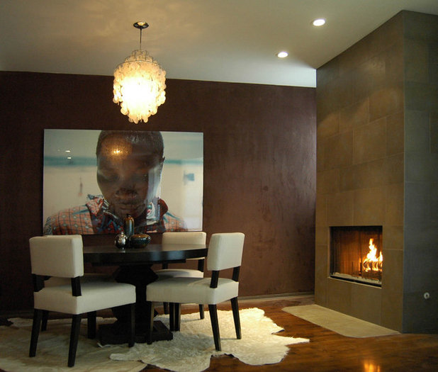
Image source: houzz.com

Aside from picking something that makes you happy and relaxed, the painting or sculpture should "pop," not melt into the background. The whole idea behind adding an art piece to a room is to give it visual interest and make the space more exciting. Good, high-quality frames, glass, or display tables are a necessary indulgence to highlight the artwork. It's also important that the piece gets proper lighting so it can be appreciated properly.

A good rule of thumb to consider when selecting paintings or posters to hang is to use the wall's length and width as a guide. For example, if the wall is horizontal, hang a horizontal painting or use a wide layout for several small pieces. If the wall is tall, a long vertical painting or decorative fabric will look great on it. This tip will make a room look bigger than it really is.

Choosing artwork for the home may require a lot of contemplation but what's essential to having a properly curated home is finding pieces that truly speak to you, the homeowner – after all, you'll have to live with the artwork day in and day out.

Architect and interior designer Jonathan Bunge, in the house. Check out my Twitter account for short updates on building and design.

Wednesday, September 14, 2016

Timeless Bedroom Designs for Girls

When designing a bedroom for girls, I always think of the next few years. Will that little girl still like her room when she reaches her teenage years? Even if most girls are into pink and purple when they’re usually in their elementary school or middle school years, their choices radically change when they reach their teens. They also begin to form their own preferences for their belongings, which is why I like installing furniture that can be easily modified through the years.


Image source: Firstclasstur.com

I like encouraging young girls to choose three to five colors that they like. Even if it’s clashing, I try to find ways to incorporate those colors in the interiors. If they are into fiery oranges and flaming reds, I tone down the hues a bit so it will work well with plain tones such as ecru and white.

Surprisingly, shades of pink, purple, blue, and green never go out of style. These four colors are also very easy to match with each other. And when a young client chooses one of these colors for the walls, I usually match white or off-white furniture to make it pop. Choosing pastel colors, in my experience, has worked for so many of my clients. They enjoy the femininity and the flexibility of these colors. On the plus side, these tones go well with the décor that they want put up in their room. Posters, framed photos, fairy lights, lamps, and even beanbags make the room more appealing.

As an interior designer, I like it when my clients have a vision of what they want their space to look like. You know what? My young clients make my job easier because they have very good ideas for their own rooms and they’re very sure of what they want.

Image source: De-index.com

 I’m Jonathan Bunge. I believe that design is life, and my job as an architect and interior designer proves my penchant for the craft. Let’s keep in touch on Twitter.